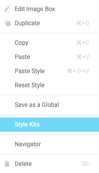
Go to the Style Kit panel, and manage the whole typography on this layout via a number of useful controls. You can also set up your Buttons and Column Gaps.
Try experimenting with the Heading sizes, for example if you tweak the Heading 2 value, the heading title above this text must change accordingly.
Keep in mind that individual element styles override the Style Kit values, so for Style Kits to work, the element must not have manually added styles.
Lorem ipsum dolor sit amet, consectetur adipiscing elit. Ut elit tellus, luctus nec ullamcorper mattis, pulvinar dapibus leo.
Lorem ipsum dolor sit amet, consectetur adipiscing elit. Ut elit tellus, luctus nec ullamcorper mattis, pulvinar dapibus leo.
Lorem ipsum dolor sit amet, consectetur adipiscing elit. Ut elit tellus, luctus nec ullamcorper mattis, pulvinar dapibus leo.
Lorem ipsum dolor sit amet, consectetur adipiscing elit. Ut elit tellus, luctus nec ullamcorper mattis, pulvinar dapibus leo.
In the Style kits panel you also have controls for the Elementor buttons, and specifically for each of their five sizes. This helps you to consistently manage the styles of your buttons.
Try dropping a new button widget here, and turn it into a different size. You should see that each size can have a completely different size.
The title of this icon box is Heading 3, and this description is body text. Try tweaking the H3 value in the Style Kit panel
The title of this icon box is Heading 3, and this description is body text. Try tweaking the H3 value in the Style Kit panel
The title of this icon box is Heading 3, and this description is body text. Try tweaking the H3 value in the Style Kit panel
The title of this icon box is Heading 3, and this description is body text. Try tweaking the H3 value in the Style Kit panel
The title of this icon box is Heading 3, and this description is body text. Try tweaking the H3 value in the Style Kit panel
The title of this icon box is Heading 3, and this description is body text. Try tweaking the H3 value in the Style Kit panel


